Table of Contents
Question Layout

Checklists within ChekRite take the user through one check/task/question at a time. This enables companies to create a consistent process that is adhered to every time by every user. Most questions have the same layout although there are a couple of other layouts that can appear.
Button Question Layout
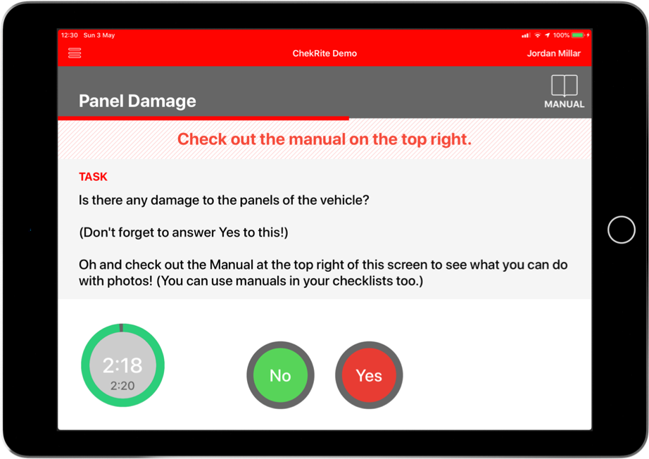
This is the most common layout of questions in ChekRite. Here is an example of a question with most elements on it.
Action Drawer
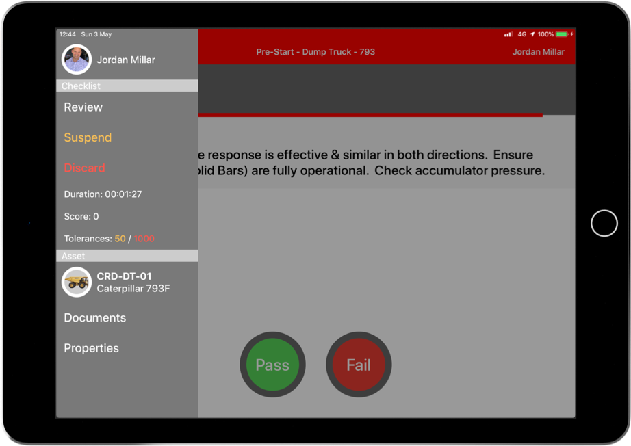
The Action button in the top left corner of the screen will open up the Action Drawer. allows you to review, suspend, or discard the current inspection. Tapping on this button presents options for this checklist as well as this asset:
- Review - displays the results of the inspection so far and allows you to view previously answered questions on this inspection as well as view photos.
- Suspend - suspends this inspection and saves the results so that it can be resumed later either on this device or another.
- Discard - quits this inspection and deletes the information captured so far.
- Duration - how long this inspection has been running so far
- Score - the cumulative total of all the fail weights from failed questions so far
- Tolerances - the first tolerance in orange is the Supervisor Tolerance for this checklist and the second in red is the Abort Tolerance.
- Asset Identification - the Asset Class, Sub-Class and Asset Number of the current asset that has been selected.
- Documents - access any documents for this asset, it's asset class or site
- Properties - display the asset properties for this asset
Question Title
In the example above this says Panel Damage. This is the title of the question and will appear on the report this way.
Manual (optional)
This may not always be present. It depends on if the checklist has been set up with manuals assigned to it. Tapping the Manual button to the top right of the screen allows you to view the manual for this question. You can pinch to zoom into the manual as well as scroll through if there is more than one page. Tapping the Close button on the top left will return you to the main question screen.
Web (optional)
This may not always be present. If the checklist has been set up with a web link you will be able to tap on it and view the web page associated with it. Of course you will need an internet connection to be able to view this content.
Progress Bar
The progress bar is the line that appears underneath the Question Title. This will be in the same theme colour as your company so in the example above is red. It shows how far through the checklist you are.
Warning (optional)
This may not always be present. It depends on if the checklist has been set up with warnings assigned to it. The warning text is the light red bar that appears under the Question Title. If there is more than one warning present, you can scroll through them.
Task
This displays the instructions of what you are to do for this question. If the instructions exceed the amount of available space you can scroll through them.
Timer (optional)
This may not always be present. A countdown timer will appear if the checklist creator has put an estimated duration for completion of this task. This timer can be dragged around the screen to a suitable position and on the iPad you can tap on this timer to make it go full screen so that you can see it from a distance.
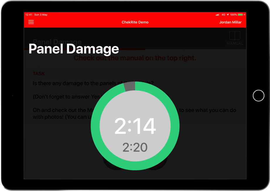
The ring around the timer is green to start with and changes to orange when there is only 20% of the estimated duration remaining for this task, and red when there is only 10%. When the timer reaches zero, it starts counting back-up in red with negative numbers to show that you have gone over this task's estimated duration.
Button Controls
This is where you select your answer for the question. Whilst ChekRite ships with several standard button layouts, your ChekRite administrator may create customised ones for your company. Buttons may be circular or rectangular. Their colours may change and so too the text inside the button. Depending on which button you press and how it has been set-up, you may or may not be presented with options to enter sub-checks or extra information.
The standard shipping button controls are below. You can see an example of what they look like in the ChekRite app here:
Control Name | Pass State | Fail State Extra Info Displayed | Caution State Extra Info Displayed | Fixed State Extra Info Displayed |
Step | Step | |||
Pass/Fail | Pass | Fail | ||
Pass/Fail/Caution | Pass | Fail | Caution | |
Pass/Fail/Fix | Pass | Fail | Fix | |
Yes/No | Yes | No | ||
No/Yes | No | Yes | ||
On/Off | On | Off | ||
Off/On | Off | On |
Gauge Question Layout
The gauge question layout is nearly identical to the Button Question layout with the exception that there is a gauge on the screen.
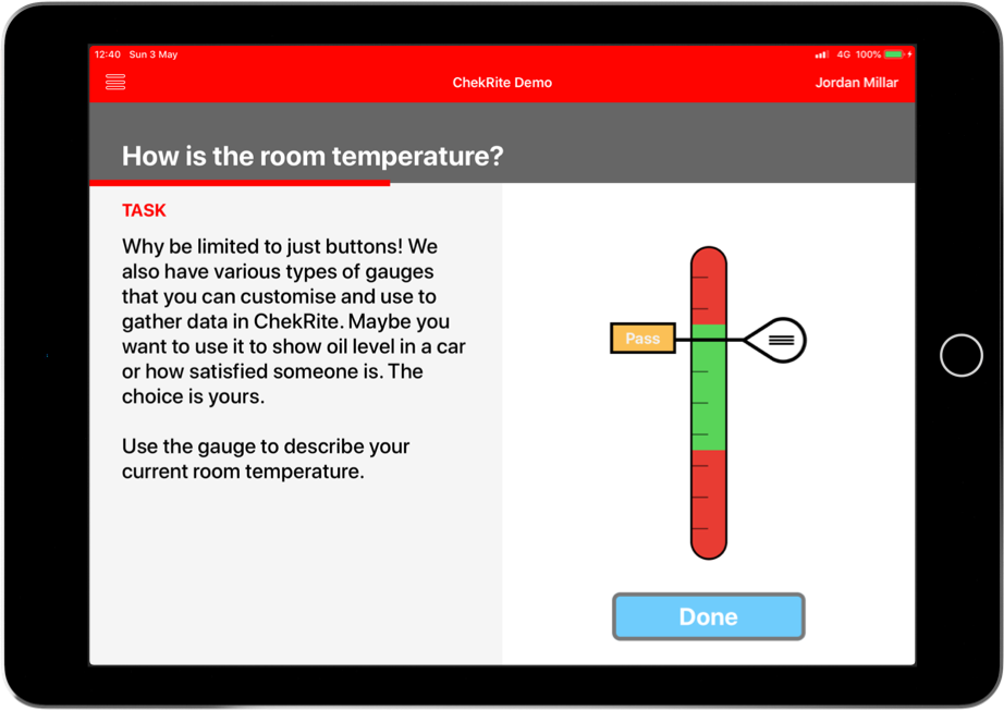
You interact with the gauge either by tapping on a spot on the gauge where you want to register your answer or dragging the "handle" on the right hand side of the gauge needle to move it to the correct position for your answer. As you move the gauge needle, there may optionally be information displayed on the needle label. This could be the status of that answer (as per the example above) or it could be another label or even the gauge value itself.
Once you have move the gauge to the correct position, tap on the Done button to move to the next question.
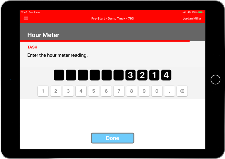
Meter Question Layout
Meter Questions automatically display a numeric keypad on the front screen of a question. These response types operate differently to standard numeric extra info types because the system verifies the user’s entry with what is recorded against the asset in the system.
For example, if the user enters an hour meter or odometer value that is less than the previous entry against the same asset ,then the user will be asked to verify that this is correct. The system does not prevent the user from entering the data, it simply asks you to verify the accuracy and makes reference to the last entry. In addition, for Hour Meter values that are more than the previous Hour Meter entry for the same asset but less than the actual maximum possible hours passed since the last entry, it will also ask for verification.
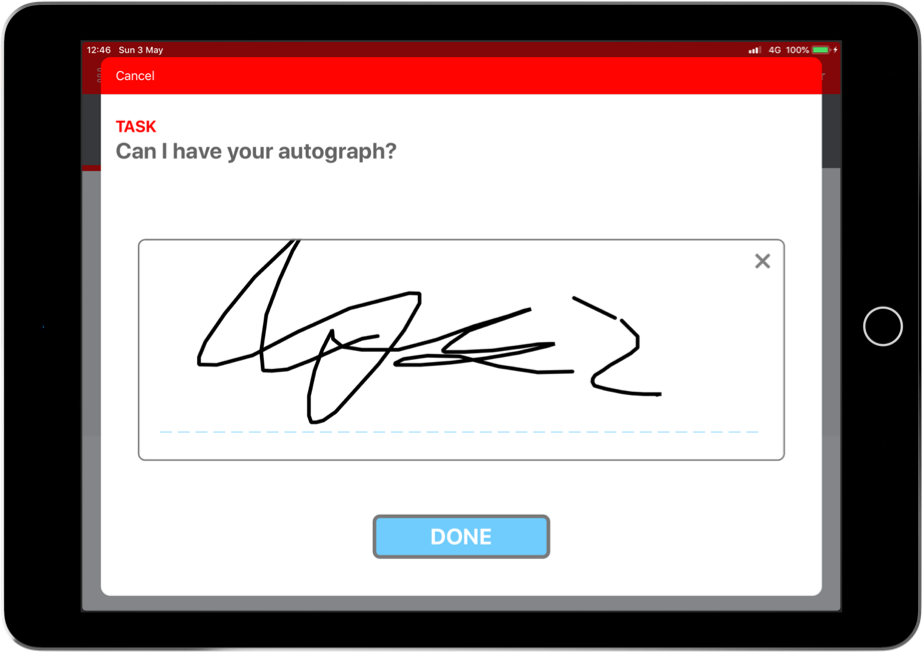
Signature Question Layout
The Signature Question displays a space for you to sign underneath the Task. Just use your finger or a stylus to sign in the signature panel. If you need to, press the “x” icon on the top right of the box to delete the signature and sign again. Press Done to continue.
Touch Point Question Layout
The Touch Point Question is designed to ensure the user is at a certain physical location during their inspection. At this location there is placed a QR code. For example, if you are examining a vehicle and want to be sure that the user checks the back of the vehicle, you can put a QR code there that says something like "Rear". The user will need to scan that QR code to move on. If for some reason the QR code can't be scanned, you can define reasons for the user to fail the question.
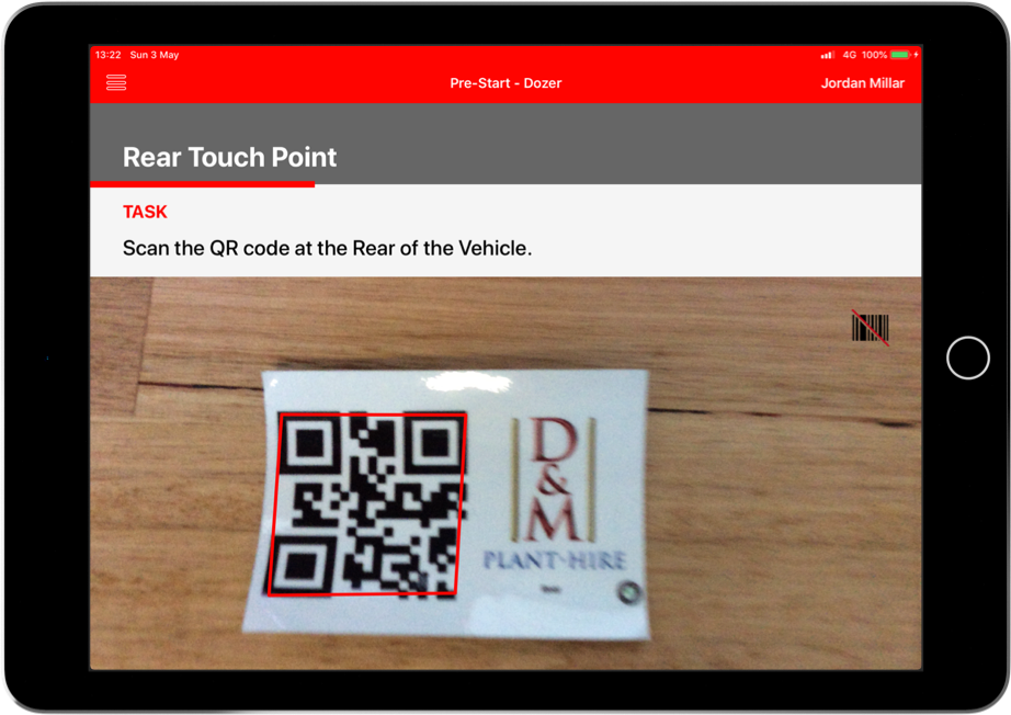
Successful Scan - QR code saying Rear was scanned (blurry because it recognises it so fast!)
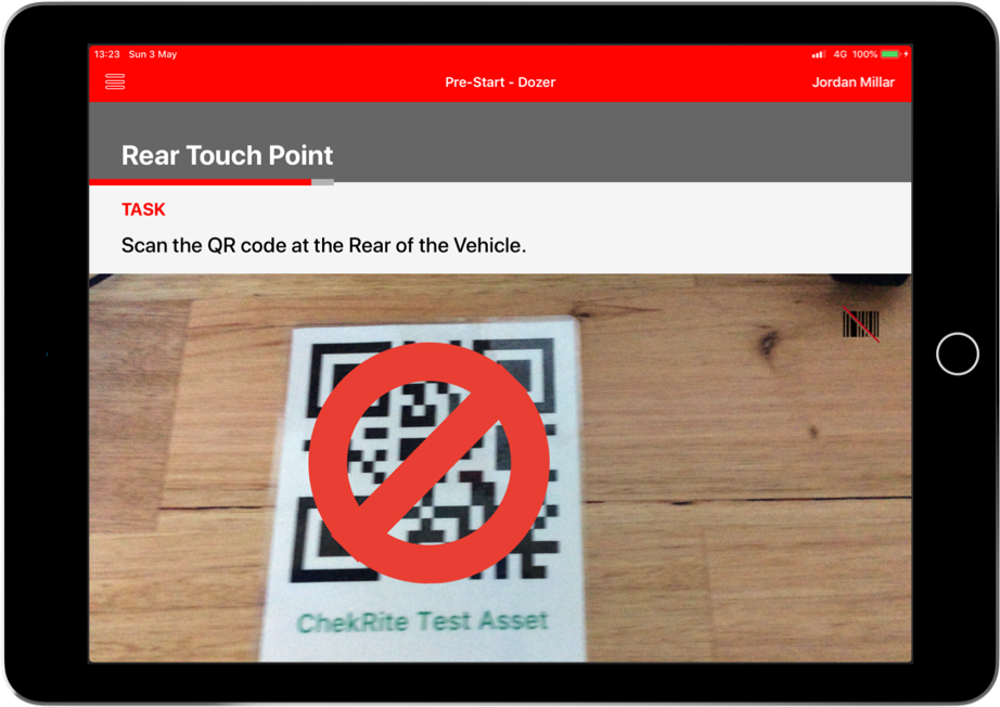
Unsuccessful Scan - QR code saying Front was scanned
Quiz Question Layout
The Quiz Question can be used to quiz the user with multiple choice answers. There can be one or more correct answers depending on how the checklist was built. In some cases, you might have to select a minimum number of answers before the Done button is enabled.
You will not be able to see the results of a quiz question in the Review option (to prevent cheating) but it the status of the question (pass or fail) will be displayed once the checklist is submitted.
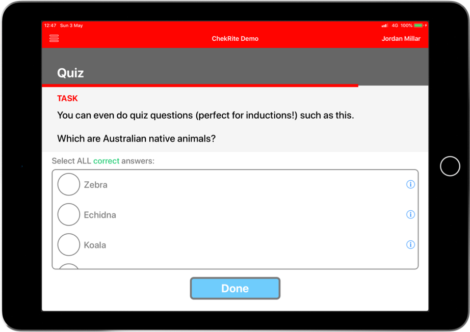
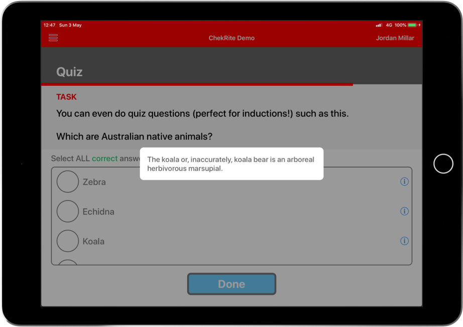
If you see a small "i" icon to the right of a quiz answer, there is more information available about that answer. Tap on that to reveal it.