Table of Contents
Designing Custom Controls

ChekRite enables system administrators to design and configure custom control buttons and gauges that make checklists more intuitive, efficient, and relevant to your workflows. These custom elements help streamline data collection and improve how information is presented and interpreted on the ground.
Custom control buttons can be tailored with meaningful labels, shapes, and colours to reflect your specific operational requirements. Instead of adding separate sub-checks, you can present choices such as “Morning”, “Afternoon”, or “Night” directly within a single step, simplifying the user experience.
Gauges can be configured with defined ranges, colour bands, and fail thresholds, giving users a clear visual cue for acceptable values and performance indicators tailored to the task at hand.
Buttons
To create a customised button do the following:
- Go to Home -> Settings -> Custom Controls
- Click the Add New Control button.
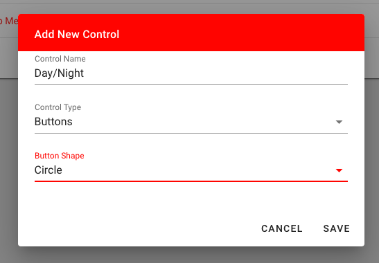
- Enter the name of your new button into the Control Name field. Refer to the Naming Controls section below for guidance on consistent naming conventions, including how to represent multiple options and indicate Extra Info triggers., and we wanted to trigger Extra Info on the first two options but not the last, we would call this button: High(EI)/Medium(EI)/Low
- Select Button from the Control Type drop-down menu.
- Select the shape (circle or rectangle or emoji) from the Button Shape drop-down menu.
- Click the Save button.
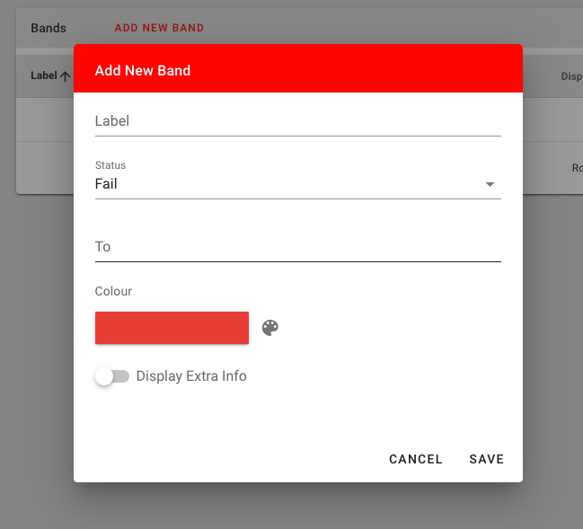
- Then select the newly created control. Then click the Add New Button button.
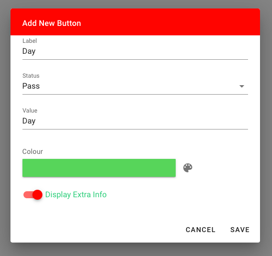
- Enter the Label of the button.
- Select the Status of this button. It can be one of: Pass, Fail, Caution, Fixed, or Undefined.
- Enter the Value of the button. This value will appear on reports.
- Select the Colour of the button. If you want to keep this in theme with all the standard ChekRite controls, you can use the ChekRite Colour palette.
- If you want the button to trigger Extra Info and Sub-Checks if they exist on the question then select the Display Extra Info switch.
- If you have another button to add, push the Add New Button button and repeat steps 7 to 12 until you have added all the buttons for this control.
Gauges
To create a customised gauge do the following:
- Go to Home -> Settings -> Custom Controls
- Click the Add New Control button.
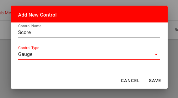
- Enter the name of your new Gauge into the Name field. Refer to the Naming Controls section below for guidance on consistent naming conventions, including how to structure names and indicate Extra Info functionality.
- Select Gauge from the Control Type drop-down menu.
- Click the Save button.
- Select the newly created control.
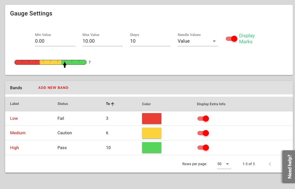
A gauge often has two or more bands on the gauge to represent different states. First of all you need to define the scale of the gauge.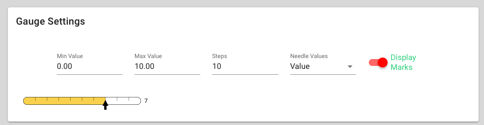
- Enter the minimum (Min Value) and maximum (Max Value) of the gauge, then the Number of Steps in the gauge. By default the gauge will be 0 - 10 with 10 steps meaning each step of the gauge represents 1 value increase. Another gauge could be 0 - 100 with 20 steps meaning each step of the gauge would represent a 5 value increase.
- Select what you would like displayed as the Needle Label. Possible choices here include: None, Value (the numeric value based on the scale and steps set above), Status (the status of the band such as Pass, Fail, Caution, Fixed, or Undefined), Label (the text label that you enter in the band).
- Decide if you want the gauge to Display Marks or not.
- Now you can enter the bands of the gauge. Click the Add New Band button.
- Enter the Label of the band. This will only be displayed if you choose Label as the Needle Labels option.
- Select the Status of this band. It can be one of: Pass, Fail, Caution, Fixed, or Undefined.
- Enter the To value of the band. This the number of steps that this band will cover. In the example below there are 10 bands in our gauge and we want the first 4 to be the first band (green). Then we want until 7 to be the second band (orange), then until 10 for the last band (red).
- Select the Colour of the band. If you want to keep this in theme with all the standard ChekRite controls, you can use the ChekRite Colour palette.
- If you want the band to trigger Extra Info and Sub-Checks if they exist on the question then select the Display Extra Info checkbox.
- If you have another band to add, push the Add New Band button and repeat steps 10 to 15 until you have added all the bands for this control.
Property Controls
A property control is used to enter a numeric value and store it as an asset property on the Asset. Most typically this would be used for capturing meter readings. By default each ChekRite environment has two meter readings built in for Hour Meter and Odometer. However, there may be situations where you need to create your own.
- Go to Home -> Settings -> Custom Controls
- Click the Add New Control button.
- Enter the Name of the Property Control.
- Click the Save button.
- Select the newly created control.
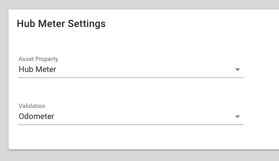
- Select the name of the Asset Property in the Property drop-down list. You should have already entered the Asset Property with the type of Numeric using the Tables & Items section.
- Select the type of Validation to be used. There are three possible choices here: None (no validation), Hour Meter (the system warns if the new value entered is less than the previous value entered, and not more than the number of hours elapsed since the last value was entered.), or Odometer (the system warns if the new value entered is less than the previous value entered.)
Naming Controls
To ensure clarity and consistency across checklists, we recommend following a standard naming convention for custom controls:
- For controls with only two options, position the "Pass" option on the left and the "Fail" option on the right.
- If a button or gauge band is expected to trigger Extra Info, add "(EI)" after its name. This clearly signals the additional data capture functionality.
- Use slash separators to list multiple options in the Control Name field (e.g., "Yes(EI)/No", "Morning/Afternoon/Night").
By adopting a consistent naming convention, it's easier to quickly understand the intent of the control and maintain uniformity across your checklist designs.