Table of Contents
ChekRite Analytics

ChekRite Analytics is our powerful business intelligence system that allows you to explore all the data you have captured with ChekRite and produce any reports. You can even schedule reports to send to yourself or others in your company.
Entry Point
When you navigate to Analytics in the ChekRite portal there are 7 different buttons to launch into ChekRite Analytics.
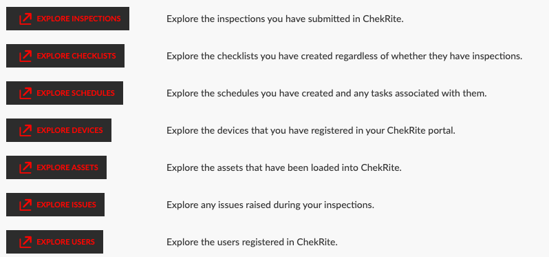
Each of these buttons will open up ChekRite Analytics but they will be from a different entry point in the database. To best understand how these entry points work, have a look at the following diagram. If you look at which way the arrows are pointing you can see the relationship between the various entries.
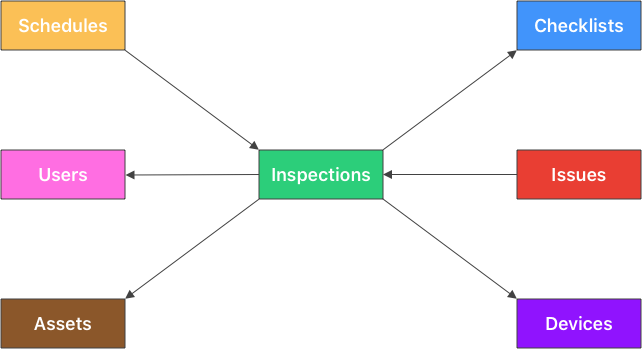
Let's take the example of Assets. The arrow flows from Inspections to Assets. This means that every inspection must have an asset associated with it (because you select the asset before you start the inspection) however, not every asset has an inspection. You may have just added the asset and at this stage, no inspections have been done on it.
So if you wanted to create a report based on all your assets regardless of whether they have had any inspections on them (maybe you want to see which assets haven't had inspections), then your entry point would be Assets so you would click on the Explore Assets button. However, if you were only interested in assets that did have inspections on them, then your entry point would be Inspections so you would click the Explore Inspections button.
In reality, most of the time, you will probably want to be exploring by inspections, so generally you will push the Explore Inspections button.
Navigation
The ChekRite Analytics interface is fairly simple and nearly identical no matter which Explore entry point you choose. You start off by exploring your data. Once you have found the answers you are after you can create a report or schedule one if you want to receive this regularly.
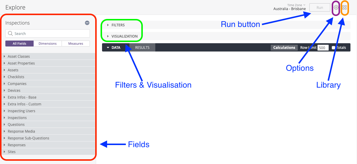
Fields | On the left hand side this will change based on the Explore entry point that you choose. These are grouped by Table and then the fields inside them. |
Filters | As you add filters to your explore, they will appear here for you to adjust. |
Visualization | This is where the finished table, graph or report will be displayed. |
Run | Push the run button at any time to see what your data will look like so far. |
Options | This is mostly options around saving, downloading and scheduling your reports once you have created them. |
Library | Here is where you can find reports created by your or others in your team. |
Building a Report
You build a report simply by clicking on the field you want in the report and it will appear in the Data window on the right hand side. If you want to remove it, just click it again. At any time, you can push the Run button to bring in the actual data from your environment so you can see what things look like so far.
There are two types of fields on the left hand side: dimensions and measures. In ChekRite Analytics, dimensions are in a grey font and measures are in orange.
Dimensions
A dimension can be thought of as a group or bucket of data or facts. For example, the date an inspection was submitted or the category of the asset. Below are several different types of dimensions.
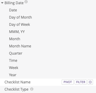
The Billing Date dimension is grouped because it's a date. Even though in our database, we only store the date as a full date and time value, when you are exploring the data you might be interested in looking at it in different ways such as the month or the day of the week. Underneath this group for Billing Date are multiple ways of viewing the same date value.
In the example above, the Checklist Name has been selected (you can see the faint white bar behind it) and so it is in our report whereas the Checklist Type (and Billing Date fields) have not been selected. You can also see the small "i" icon beside some fields indicating there is information describing this field in more detail if you move your mouse over it.
Beside the Checklist Name field you can see two buttons: Pivot and Filter. These buttons appear when you select a field or move your mouse over it. Pivot will pivot your results by the field you have selected and filter allows you to filter the results.
Measures
A measure is information about that bucket of data. You might think of these as calculations such as, total number of inspections, or average duration of inspections.
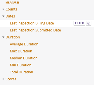
Above you can see some groups of measures. Again, like dimensions you can see the difference between a selected measure (Last Inspection Billing Date) and an unselected one (every other measure). You can also see a Filter button allowing you to filter against any measure.
Filters
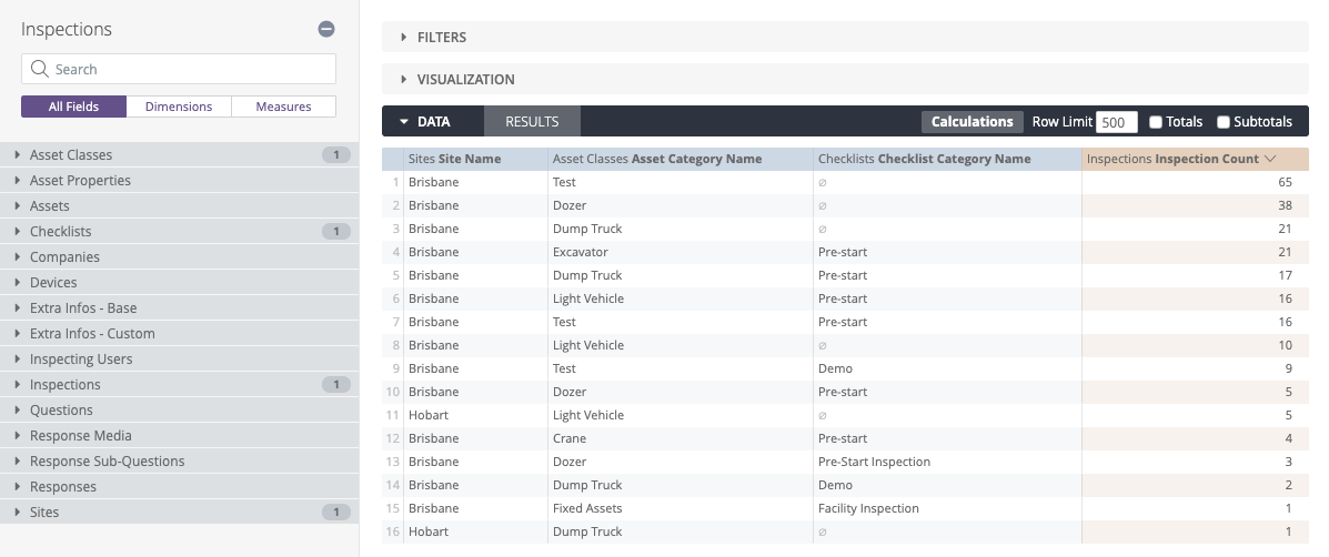
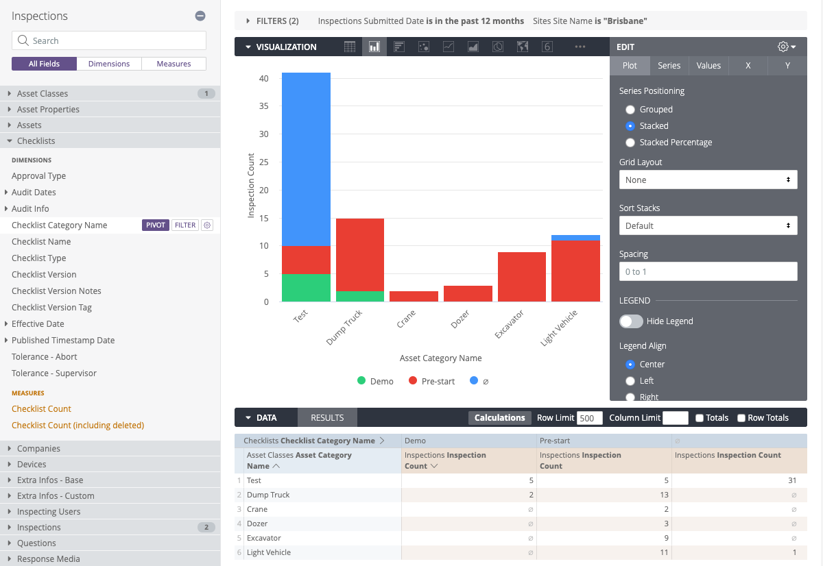
One of the most common things you will do in a report is filter out unwanted data. ChekRite Analytics makes it really easy to do this. Below is a fairly simple report that is showing number of inspections by asset category and checklist category by site.
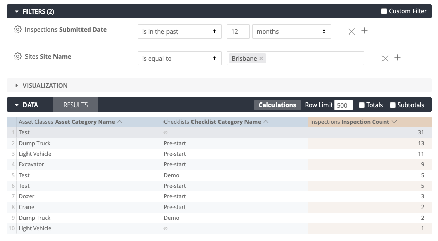
However, what if I wanted to just see the Brisbane inspections and only look at inspections that had occurred in the last year. To do this, I simply click the Filter button beside Site Name in the field list and then beside Submitted Date. (Note that Submitted Date doesn't have to be a selected field in my results.) I adjust the parameters for the filtering that I want and get the following:
Visualisation
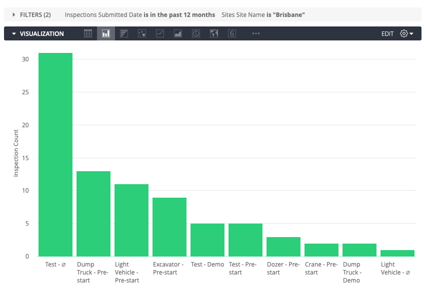
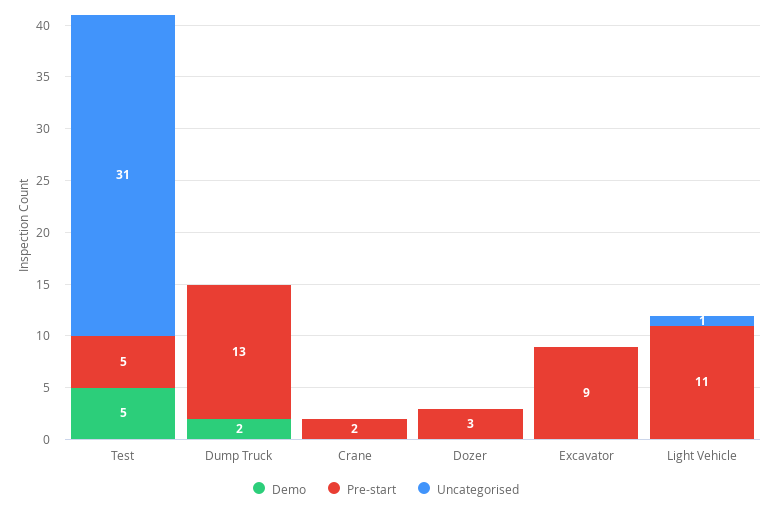
Now that you have the data that you want, we can turn that into a better visualisation for end users. If I click on the Visualisation section and collapse the others, you can see a default guess at the visualisation below. There are several different types of visualisation you can choose from such as tables, bar charts, pie charts and others.
We can make this a bit better though. To the right of the visualisation bar is small gear icon that lets you adjust the parameters such as colours, etc. Below I have chosen to Pivot on this report on Checklist Category Name, and then under the Visualisation Settings, I have said to Stack the similar values.
After adjusting a few other settings such as the label on the Null categories to Uncategorised, hiding the axis name, and showing the values, we get the following graph.
Saving a Report
Now that you have created your report you may want to save it or share it. For this we use the Options menu at the top right.
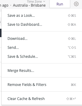
Here is what each of these options do:
Save as a Look | Save this report as it appears now for you to run at any time in the future. |
Save to Dashboard | Start building a dashboard with this report and add others to it to get a single dashboard with multiple reports in it. |
Download | Download either the data behind this report or the report itself in different formats. |
Send | Send this report to others in a variety of formats. This can be anyone internal or external to your organisation. |
Save & Schedule | Save this report and schedule it to be sent on a regular basis. |
Merge Results | Allows you to create a query from an Explore, then add queries from other Explores to display the merged results in a single table. From there, you can examine the data, pivot fields, and create visualizations. |
Remove Fields & Filters | Clear your work area and start again with building a new report. |
Clear Cache & Refresh | Sometimes to make things run faster, ChekRite Analytics will cache the data. To clear this cache and get the latest results from the database select this option. |
Scheduling a Report
ChekRite Analytics allows you to schedule reports to come out on a regular basis to different users. You can schedule these reports to go in a variety of formats with a very powerful yet flexible scheduler.
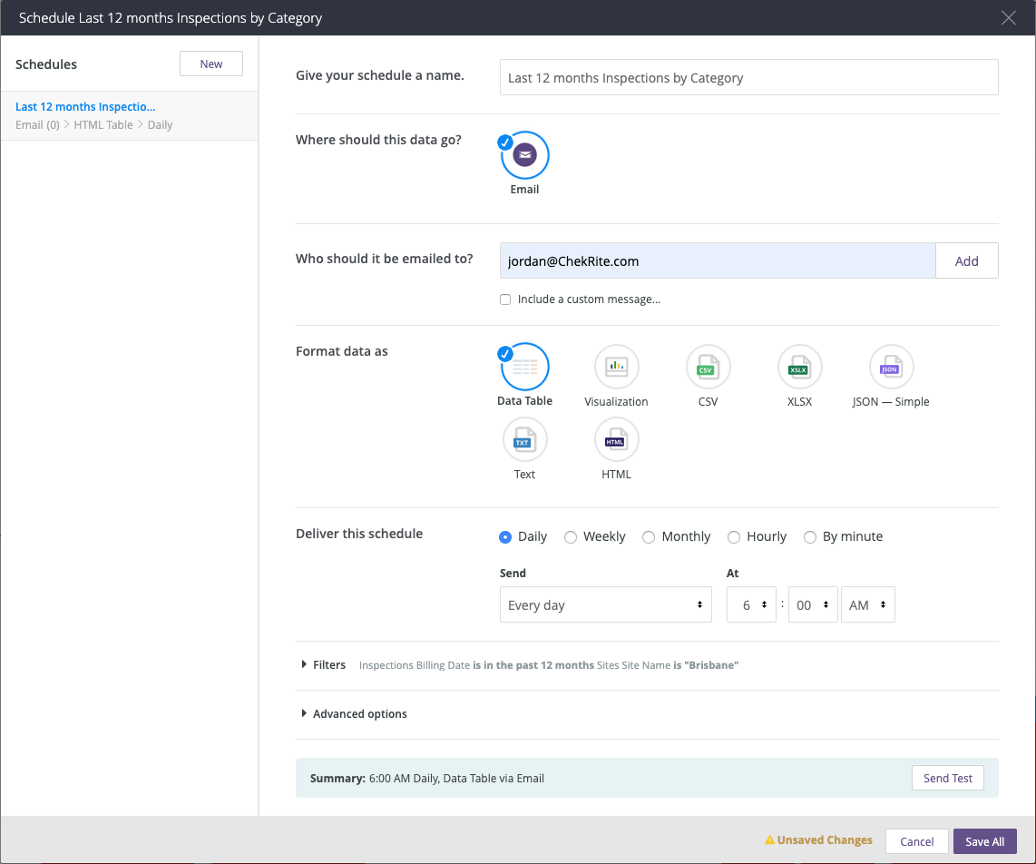
To schedule a report:
- Enter a Name for the schedule.
- Enter the Email addresses of who you want this report to go to.
- Optional: Include a message to go with this email.
- Select the Format of the report. You can send various visualisations or raw data in a variety of formats.
- Define the Schedule of when this report is to be sent.
- Optional: Send a test of this schedule. This will send to all the recipients that you have in the email address section above so be sure you want to do this.
- Save your schedule.
At the designated time, the report will be regenerated with the latest data and sent to individuals in your organisation.
Your Library
Under the library icon there are three areas where you can find reports: Personal, Group, and Shared.
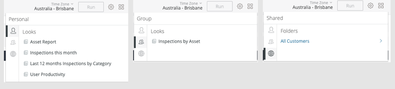
Personal | These are where you store your personal reports that only you can access. |
Group | This is where you store reports that you want others in your company to access. |
Shared | Here is where you will find reports that ChekRite has created for our customers or specifically for you. |
When you are saving a report be sure that you give it a relevant and descriptive name, and save it in the right area so that you can find it again in the future.