Table of Contents
Sub-Checks & Extra Info
There are instances when ChekRite prompts you to capture more information. This is usually when a question "fails", however, the checklist creator may also set up the question in the portal in order to gain some extra detail. The two basic types of information are Sub-Checks and Extra Info.
Sub-Checks
Think of sub-checks as being similar to multiple choice answers that provide a simple, consistent description.
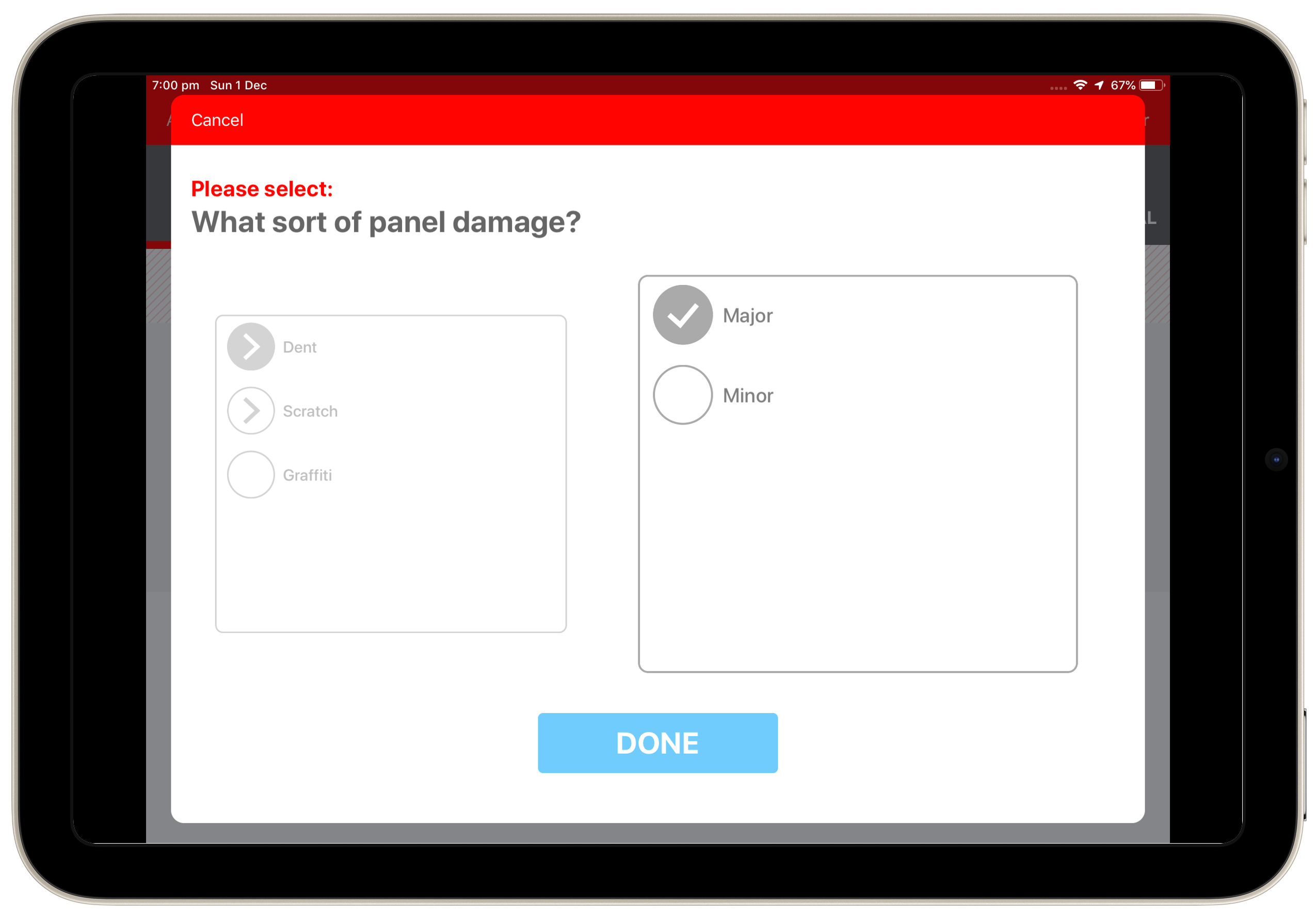
Depending on the design within the portal, sub-checks either appear as a single list or as a multi-layer hierarchy and you may also be able to select one or multiple sub-check selections.
When a circular cell with a right-facing arrow appears next to a sub-check this indicates that there is a second tier of sub-checks to select from. This second box of sub-checks appears once you have selected the first sub-check tier. If multiple selections are permitted, then you have the option after selecting from the first sub-check nodes to go back to the first tier box and select further nodes.
Should you wish to de-select any sub-checks, just press on them again. When you are finished, press Done to proceed.
Extra Info
There is an extensive list of different types of Extra Info (extra information) that can be triggered to capture further detail about the question you are answering.
At times the capture of extra information is set to mandatory in the portal. This means that you can't select the Done button until data has been inputted. If, however, you need to change what you have entered or go back to the front page of the question, just press the Cancel button located in the top left hand corner of the Extra Info box.
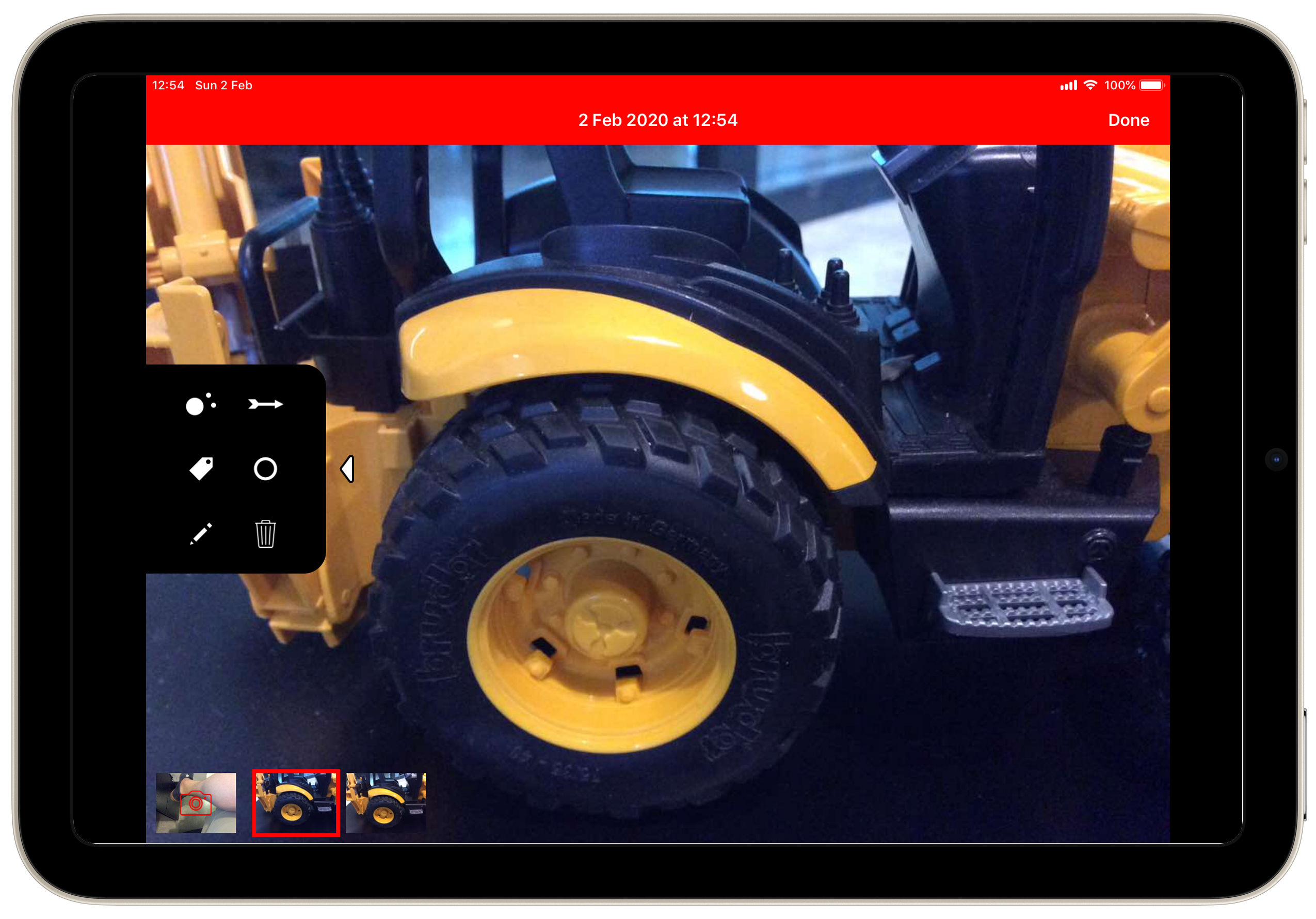
Photo
If triggered, the ChekRite App automatically activates the device’s camera. All you need to do is point your device at what you want to photograph, wait for auto-focus, and press the white circular button to take the photo. You can also pinch-to-zoom prior to taking a photo as well as turn on your device's flash.
Any images taken appear in a film strip at the bottom of the screen and the App will stay on camera mode ready to take further images. Take as many images as you think necessary. You can even annotate a photo by selecting it from the lower pane. This opens an annotation panel which xxx
To delete a photo, select it from the lower pane. Tap on the Trash icon in the annotation panel and when prompted select Delete.
Photo Annotation
When you tap on a photo in the film strip, you will be presented with the photo annotation controls. This slide out panel lets you choose from different tools to annotate any photos you have taken.
Octopus  | Octopus is a combination of putting a label on something as well as showing where that item is. When you use the Octopus control you first of all tap the t icon on the bottom left to add the label for this annotation. You will be presented with a list of the sub-checks that you selected prior to taking the photo. After that you add "tentacles" with the icon on the top left. Change the colour of this control with the colour icon on the bottom right and delete it with the control on the top right. 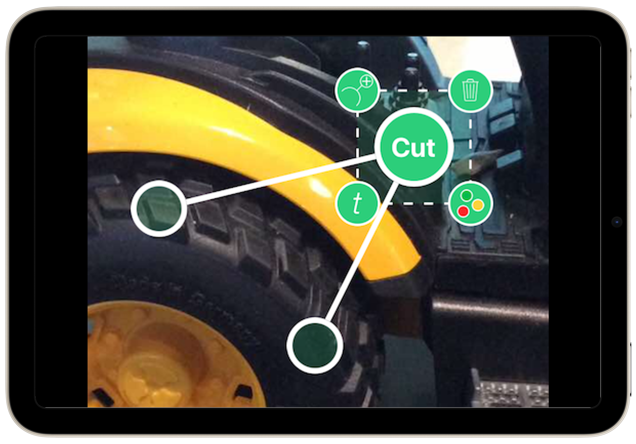 |
Arrow  | Arrow is used to point to something in the photo. At the top left you have a control that will let you change the size and shape of the arrow just by dragging it. At the bottom left the rotation control will let you spin the arrow to point in different directions. Change the colour of this control with the colour icon on the bottom right and delete it with the control on the top right. 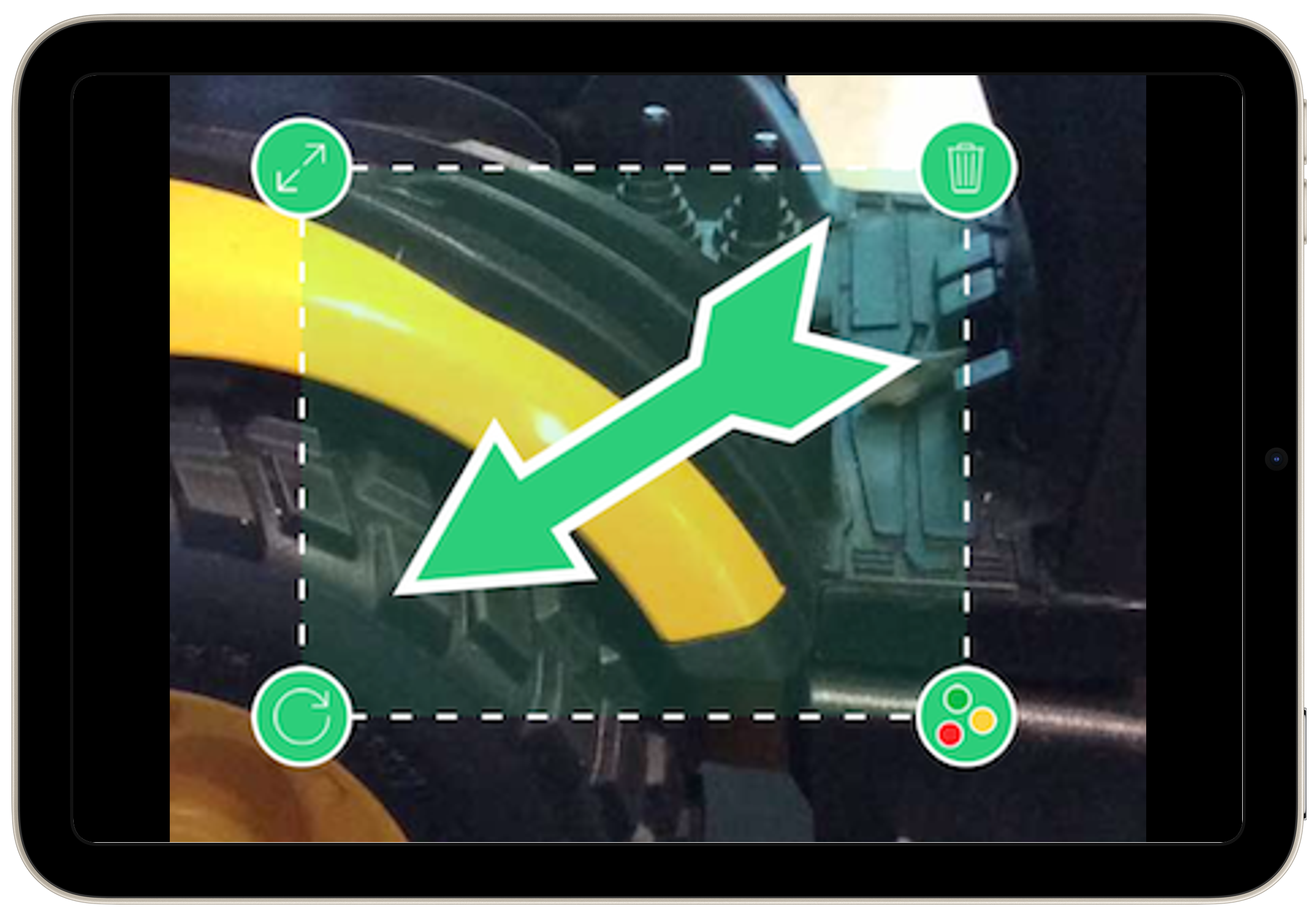 |
Label  | The label control allows you to put labels on your photos without any typing. Tapping on the t icon on the bottom left will show you all the sub-checks that you have selected prior to taking the photo. You can then select one of them to appear in the label. At the top left the rotation control will let you spin the label to point in different directions. Change the colour of this control with the colour icon on the bottom right and delete it with the control on the top right. 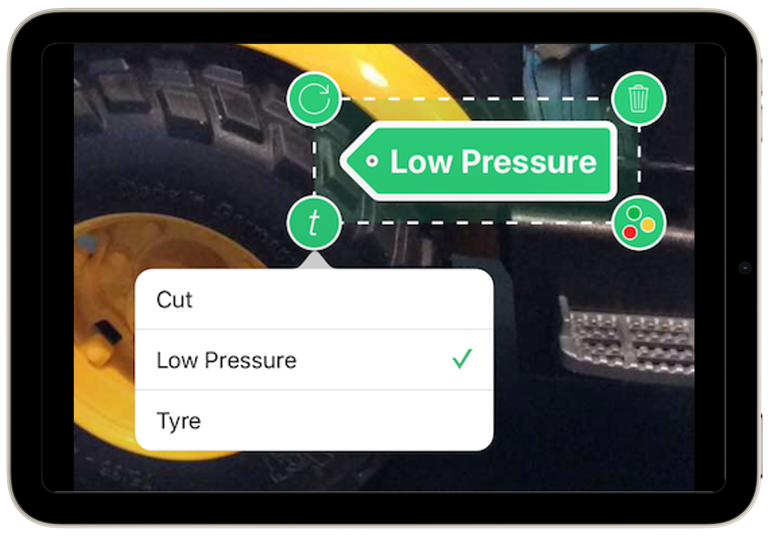 |
Loupe  | Loupe or magnify is way of showing a specific detail in the photo without losing the context of where it is. So instead of taking a close up photo of a chip in a windscreen, you can take the photo a bit further back to show where on the windscreen it is and then use a loupe to zoom into the detail. The icon at the top left will let you adjust the size of the area you plan to zoom in on. The icon at the bottom left will bring up the magnification levels you want to show the area inside the circle. Change the colour of this control with the colour icon on the bottom right and delete it with the control on the top right. 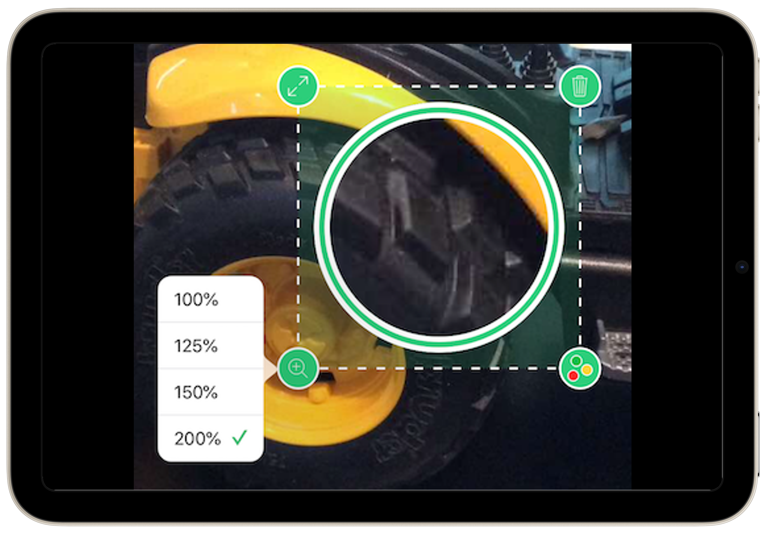 |
Pencil  | The pencil allows you to draw a freehand area with your finger to highlight a specific area of the photo. At the top left the rotation control will let you spin the annotation. Change the colour of this control with the colour icon on the bottom right and delete it with the control on the top right. 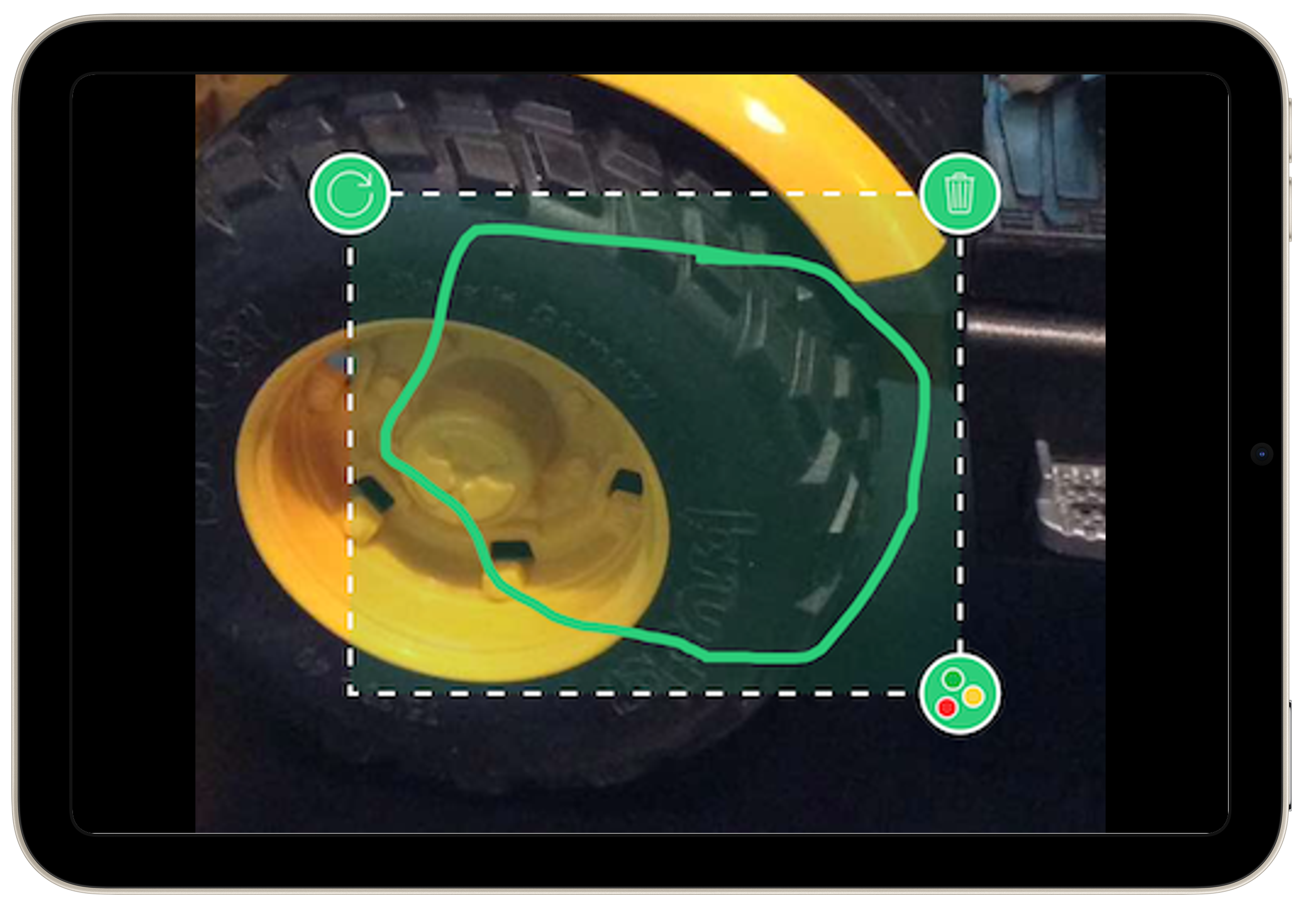 |
Trash  | Pushing the Trash icon will delete the selected photo after you confirm this is what you want to do. 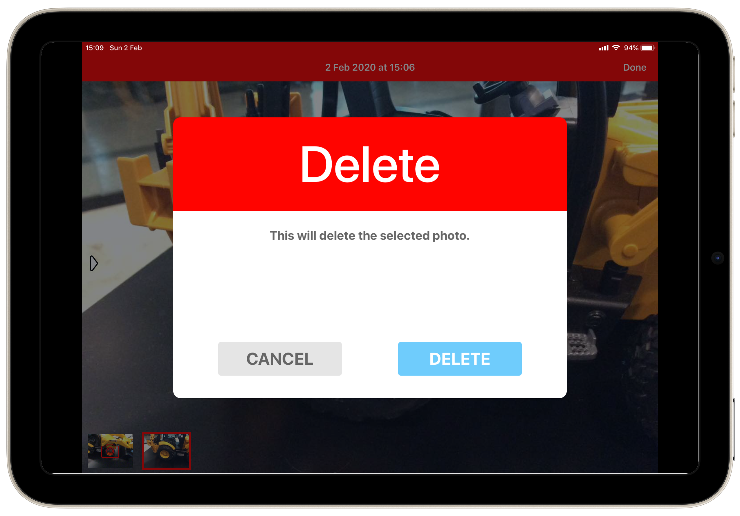 |
Photo (B&W)
This Extra Info is identical to the Photo Extra Info except the camera is forced into a black and white mode. This is very handy for taking photos of ID's or licences where you may not be permitted to take colour copies of the ID for fear of identity theft. If this Extra Info is configured there is no way for the user to switch the camera out of black and white mode for this Extra Info.
All the same annotations that exist for Photo also exist for Photo (B&W).
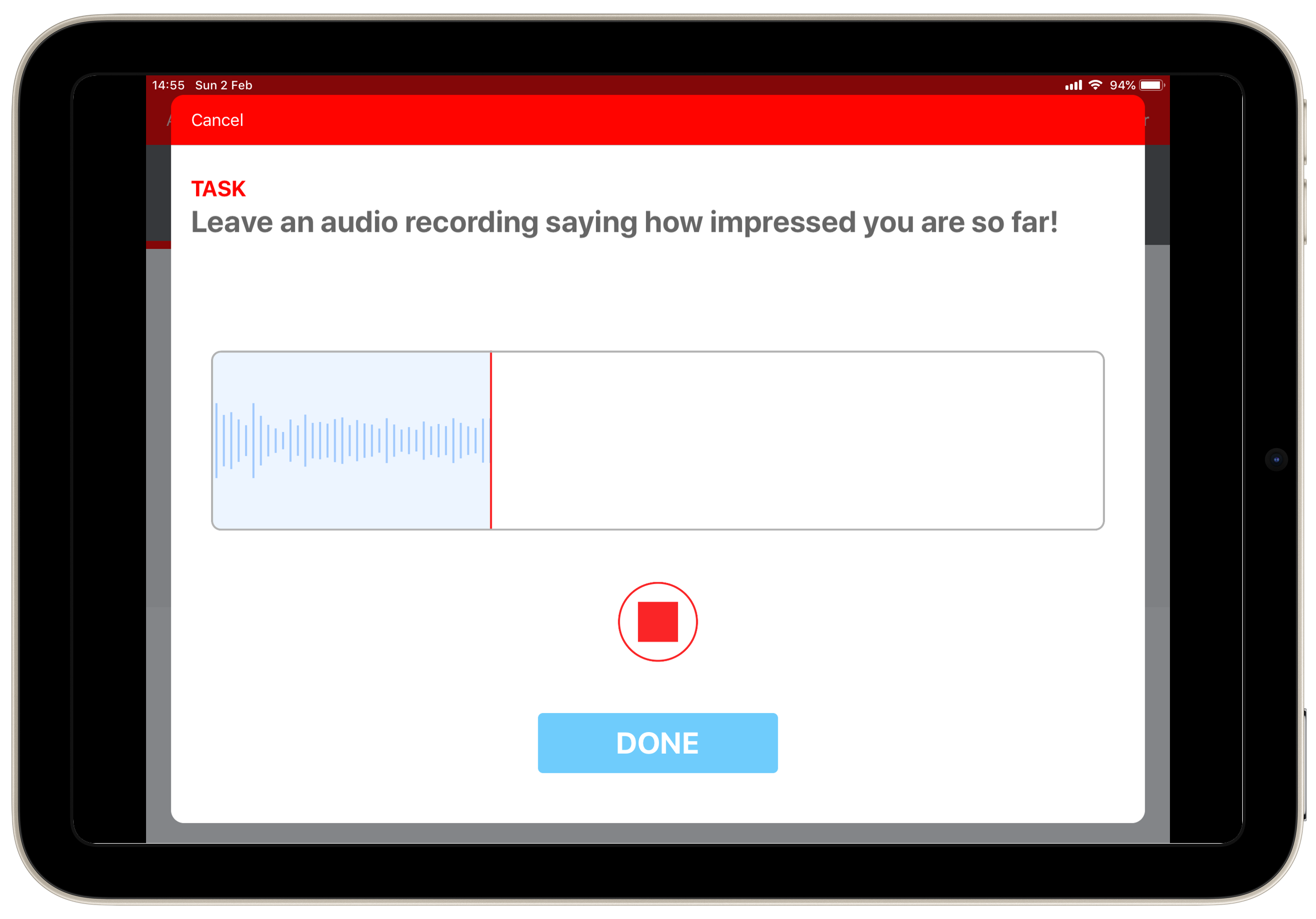
Audio
If Audio is triggered, press the circular red button in middle of screen to begin recording. You can record up to 30 seconds of audio. When you are finished, press the red square button in middle of screen. You can listen to your recording if required by pressing the green triangular button in middle of screen. To delete the recording press the x icon in the recording panel.
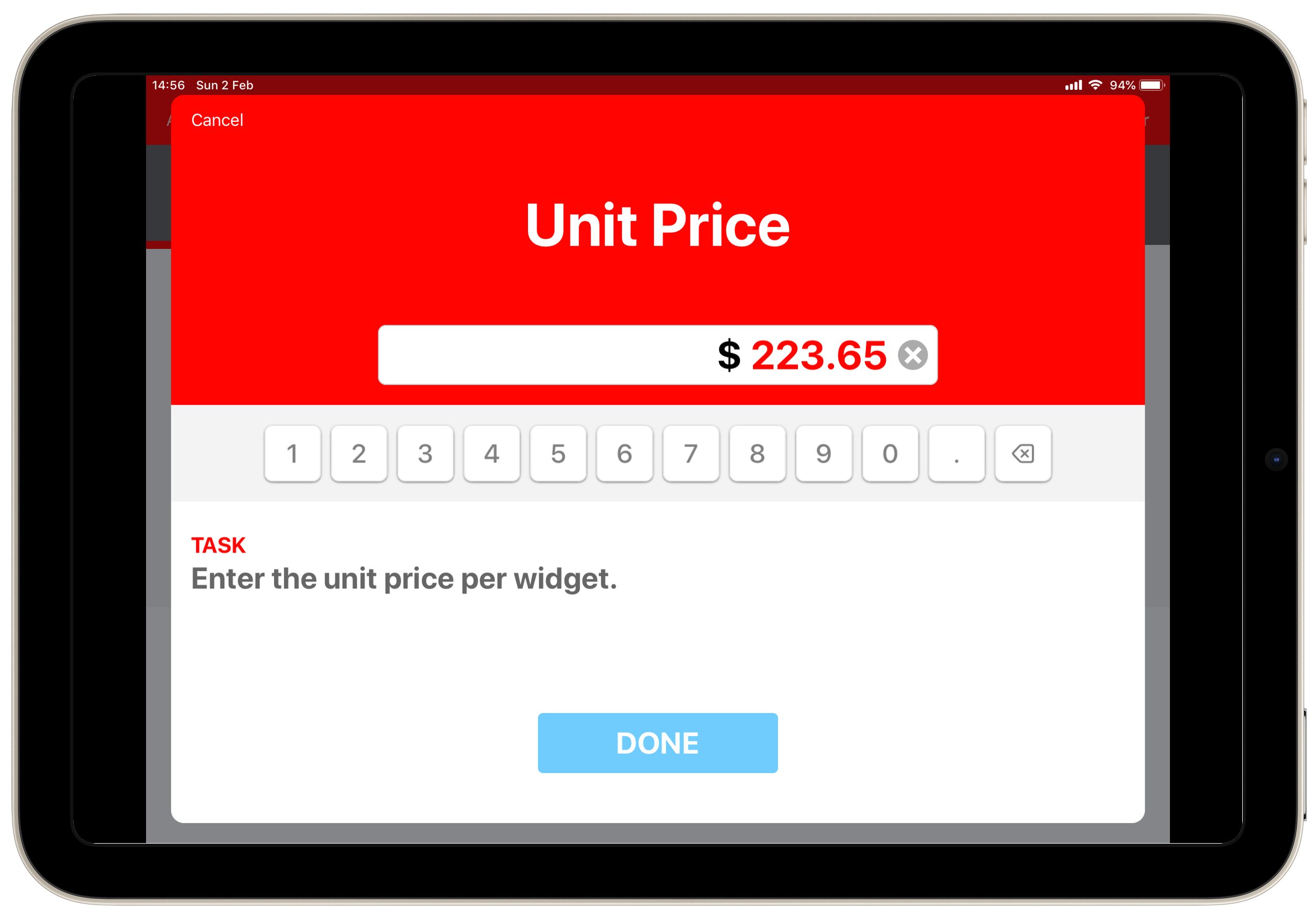
Numeric, Decimal & Currency
When Numeric, Decimal, and Currency Extra Info are each triggered, a keypad automatically appears. Enter the value and press Done to continue. The only difference between numeric and decimal is that decimal allows you to enter a decimal point when necessary. Currency includes decimal point as well as the currency specification in the input field.
Negative values can be entered if the check has been designed to allow this. If so, + and - symbols appear next to the keypad. The default is +.
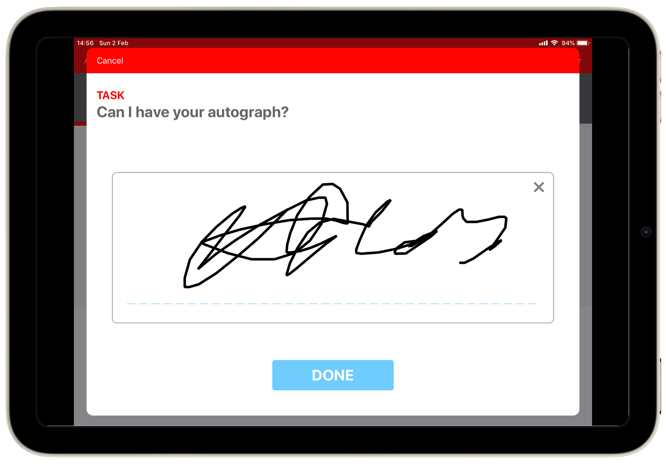
Signature
When Signature Extra Info is triggered, the signature panel appears automatically. Use your finger or a stylus to sign in the signature panel. Press the “x” icon on the top right of the box to delete the signature and then sign again. Press Done to continue.
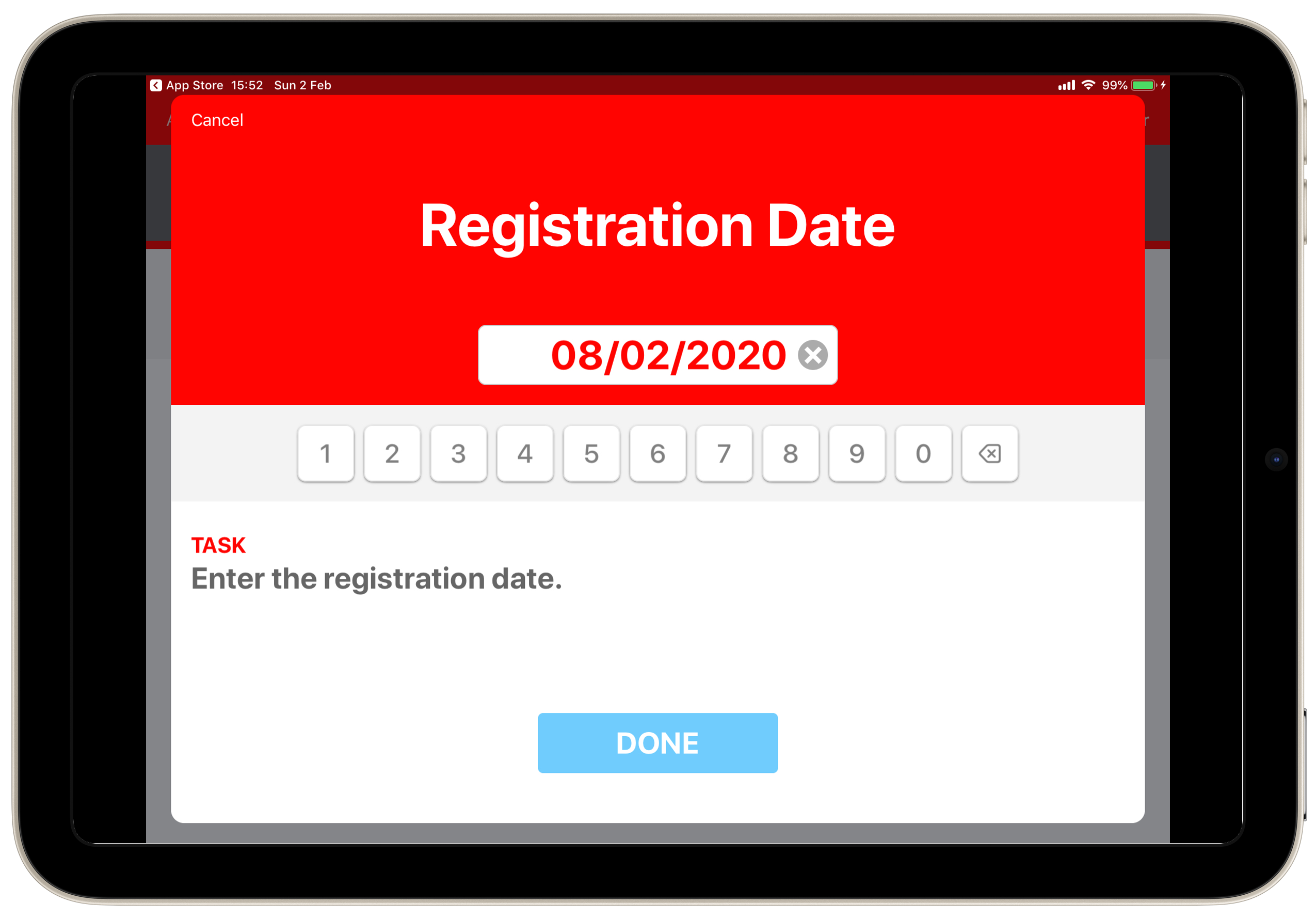
Date
Should the Date Extra Info be triggered, the keypad automatically appears and the designed date entry format will is displayed in the input field. It's possible that the date control could be set up to default today's date, or the first or the last day of the current month. Enter the date in the specific format and press Done to continue.
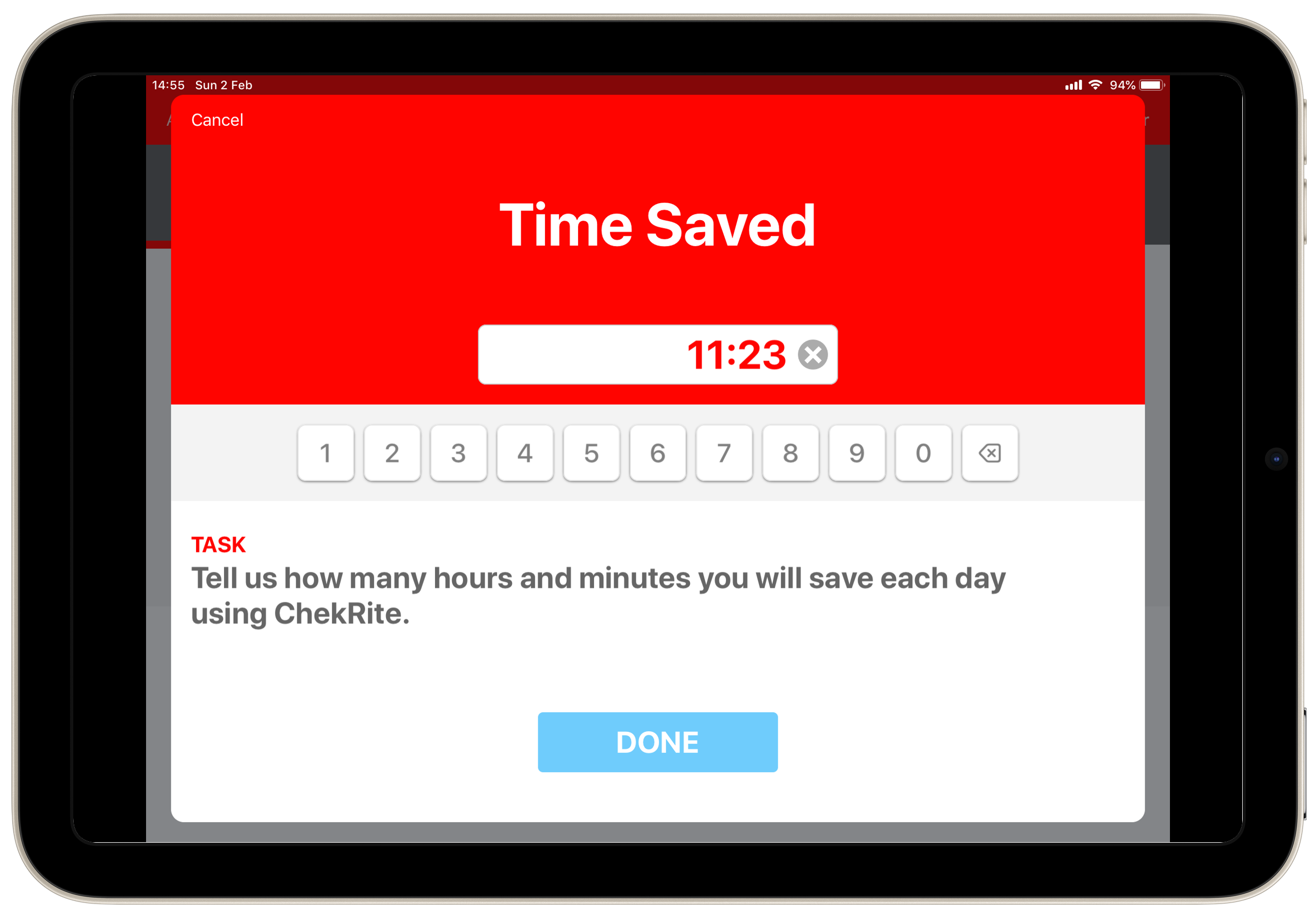
Time & Duration
When Time or Duration Extra Info is triggered the keypad appears automatically and the pre-designated entry format displays in the input field. Time Extra Info includes the option to toggle between AM and PM to the right of the input field. The default is AM.
Serial & Bar Code
If Serial Number Extra Info is triggered a keypad appears which allows the entry of alpha or numeric characters. The default is the alpha keypad, however, you can switch to the numeric keypad by pressing the 0-9 button on the right of the input field. The numeric keypad includes a decimal point, however, no other punctuation (including spaces) or symbols are available.
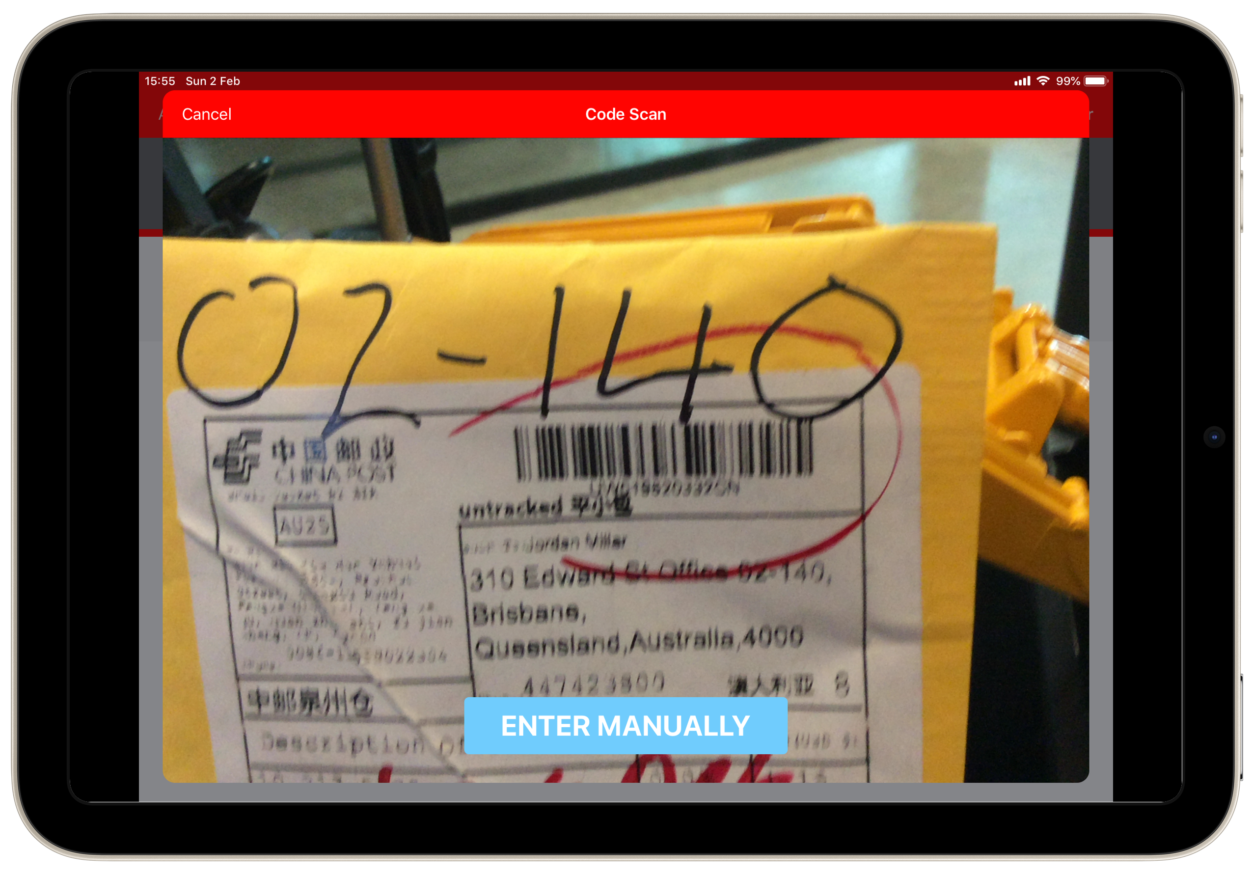
Serial Extra Info also incorporates barcode and QR code scanning capability. If you have components or items coded and wish to use this feature rather than manually entering into the keypad, press the Scan Code button in the top right to activate the device’s camera will be activated. Point the device at the code and it will scan and automatically enter the serial into the input field.
When assigned to a question, Bar Code automatically activates the camera for the purposes of scanning without you having to select Scan Code. However if the barcode is damaged or can't be read properly you can tap the blue Enter Manually button to bring up the keypad.
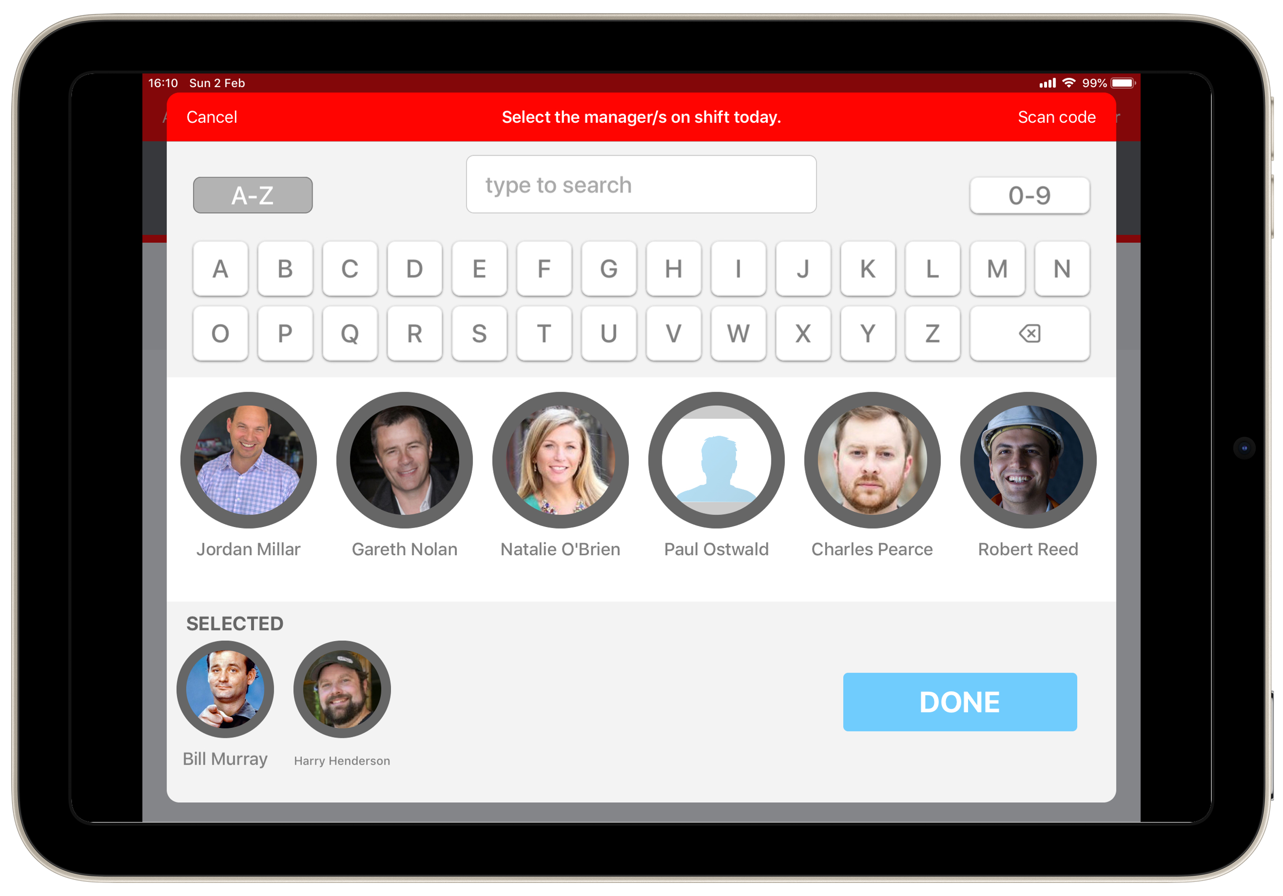
Employee & Asset
Employee and Asset Extra Info both trigger a search keypad along with a horizontal scroll pane of either employees or assets to select from. Press on the employee or asset icon of your choice and it will move to the lower pane. You may select multiple employees or assets if the check has been designed this way. To de-select simply press on the employee or asset that you have selected in the lower pane and it will be moved back up to the upper pane.
Using the alpha or numeric keypads will search for employees or assets that have the inputted numbers or letters in the name. Scroll by dragging your finger horizontally along the pane.
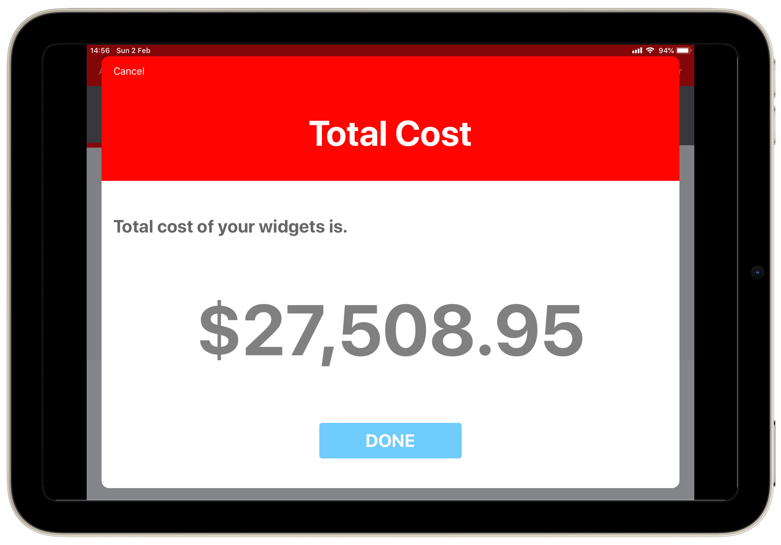
Calculated
Calculated Extra Info is a calculation built into a question based on other types of extra info captured and appears for your own reference. This calculation also appears on any reports created. If a check has been designed to incorporate Calculate Extra Info, it will appear automatically and does not require you to input any data. All you have to do is press Done to continue.
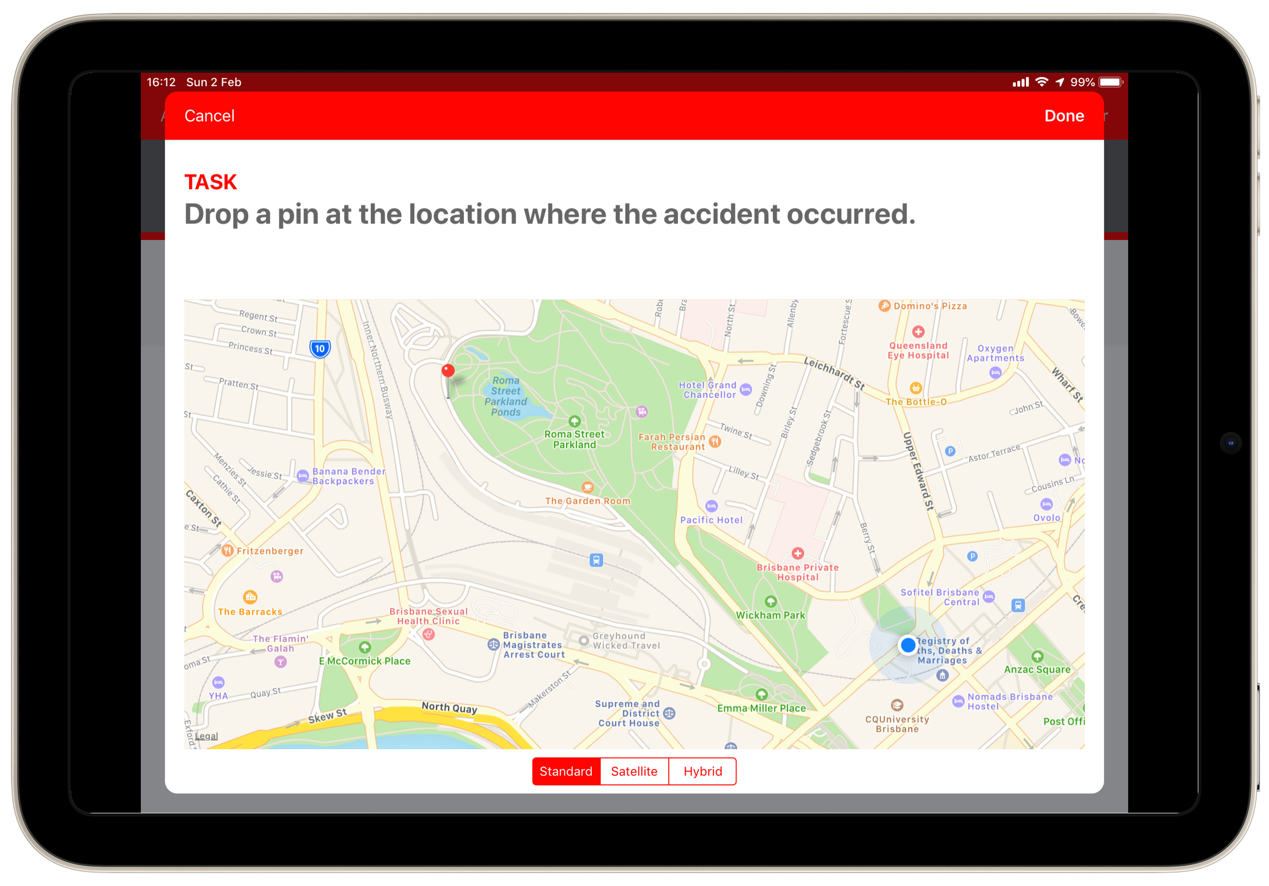
Location
Whilst ChekRite records the location where you are undertaking an inspection, you may want to show a different location as part of your answer to a question. You can do this using the Location Extra Info. When this Extra Info is triggered it displays a map and your current position is highlighted with a blue dot. You can drag around and zoom in or out the map to find the right place. You can even switch between map and satellite mode. Once you have the map in the position you want, just tap on the screen to drop a pin and mark the location. You can move the pin around if you need to.
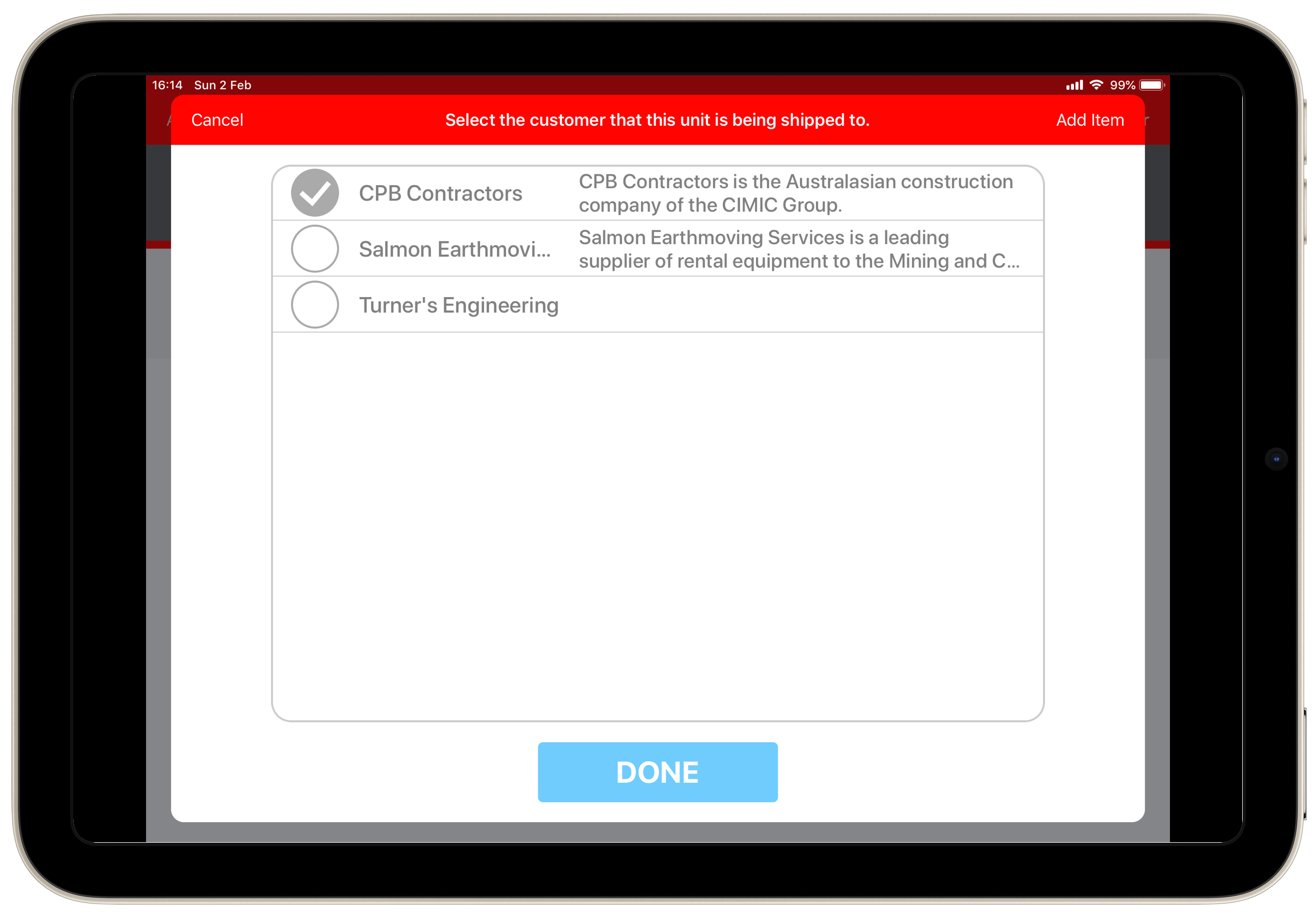
Dynamic List
A Dynamic List can be used to select from a list of values that might change from time to time such as Project Names or Customer Name. You can see how to create these on the portal here. If there are more than a screen full of items on the list you can bring up a keypad to filter to the ones you want. There may optionally be a longer description beside each item. If the checklist has been design to, you may optionally be able to add new items to this list on the fly with the Add Item button on the top right.
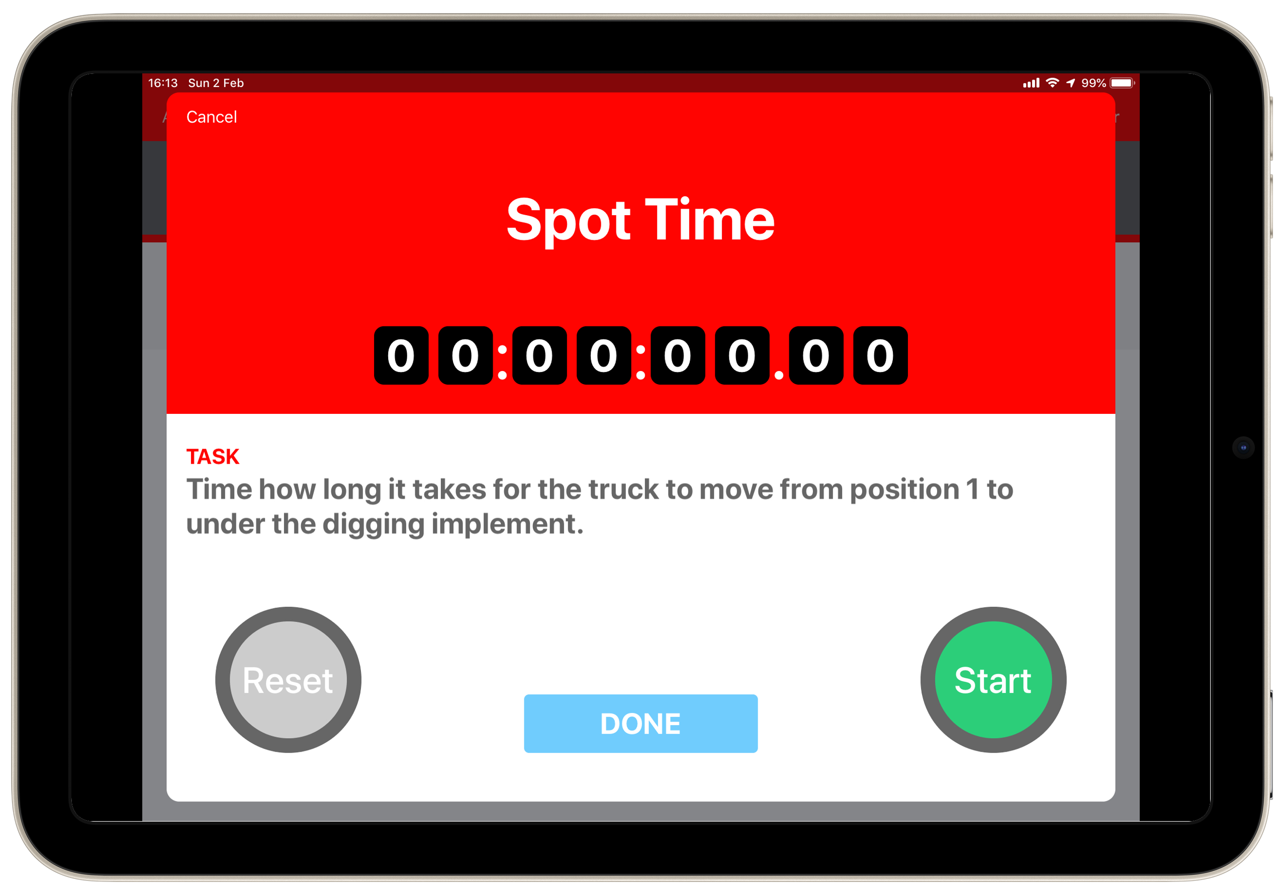
Stopwatch
There might be occasions where you need to time how long something takes. For this use the Stopwatch extra info. Just tap the Green start button to start the timer. It will then change to a Red stop button to end the timer. If you want to reset the timer to start again push the Grey reset button.